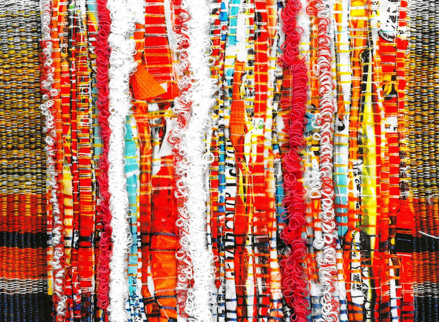
Miao: Developing Digital Print into illustration
I developed my digital prints further, refining them to create increasingly abstract designs that were larger in scale and that also reflected our new colour palette in slightly more muted tones. By playing with their composition, I believe that it makes them more relevant to fashion, and therefore makes it more likely that they would cohesively work with our overarching group theme. We found, as a group, by layering my prints with other members samples, it 'calmed' them down and made it look sophisticated.
This is an example of one of my initial garment designs using my prints. Although the overall composition of the garment is simplistic, I think that this allows the print to speak for itself. I have also been further inspired by textiles designer Chloe Scadding (Right of my illustration) who's laser cut compositions reflects the repetition of simplistic shapes in my own prints.
Below are some examples of my 'toned down' prints which relate to the colour palette better than previous examples. The garments are reflections from my draping on the stand technique which allowed me to consider necklines and shapes in a different way, taking tailoring as inspiration, but still reflecting back to the layering concept featured in traditional Miao garments.


Comments
Post a Comment