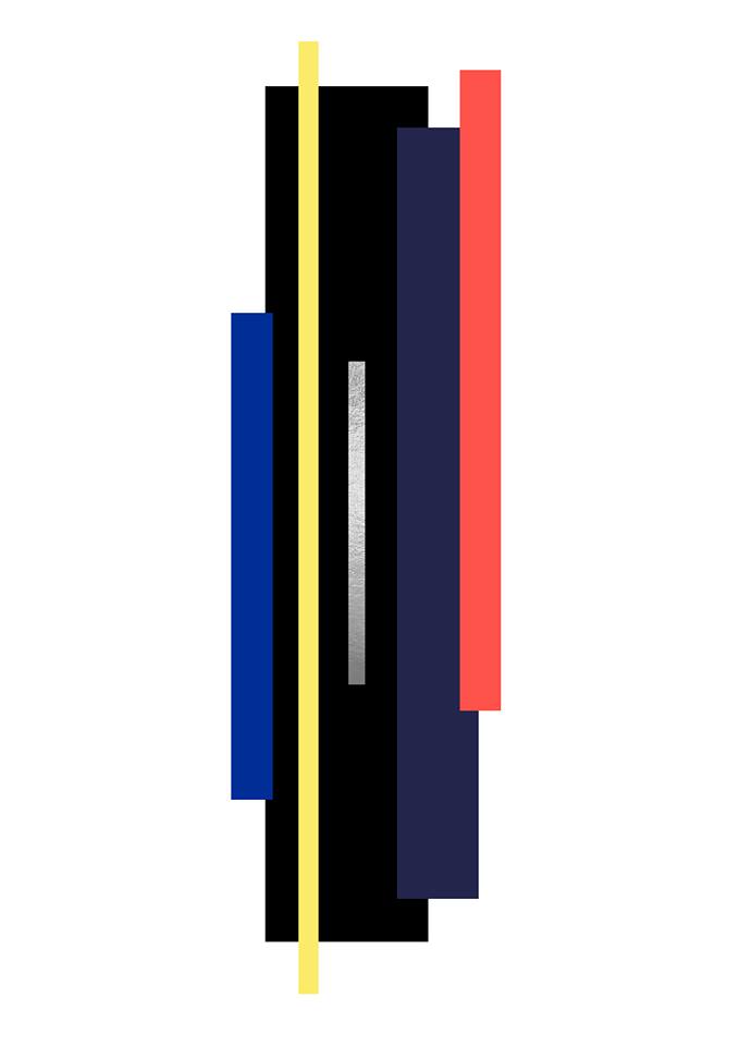
Miao: Refining our group Colour palette
Our first colour palette development was created due to being inspired by the use of neon lights in shanghai and other built up Chinese cities. We responded directly to this, keeping our colour palette minimal, thinking about the contrast of dark hues with the brights and how they would interact with each other. The hint of silver reflects the industrial element of our concept, therefore we as a group are looking forward to potentially incorporating metal wear in our collection. My first initial thoughts regarding this particular colour palette are that I'm going to find it difficult using minimal colour within prints and designs, this is mostly because I'm so used to being bold and clashing with my use of colour in previous work.
 |
| First group development of a colour palette |
 |
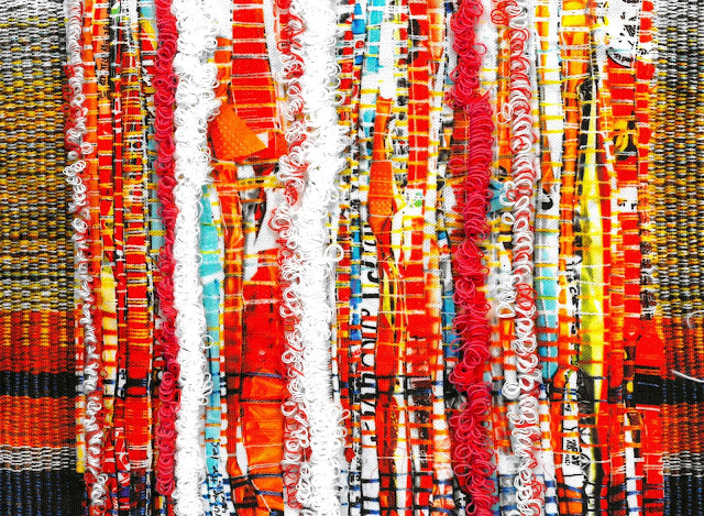
| Our 'colour palette' fabric board from our presentation |
Shortly after the group presentations, we had a colour workshop with Sarah which allowed us to really consider the colours and compositions we were intending to use within our body of work. After mixing colours and reconsidering their tones we settled on this colour palette which contains slightly more muted blue tones, a pastel yellow and a more coral-toned pink. I think this redevelopment will make our work look contemporary and more wearable within our garment compositions as before we received critical feedback which highlighted how we were perhaps 'throwing too much into it'. Moving on from this, I will really start to consider sophisticated use of colour and consider the concept of 'colour blocking', and perhaps concentrate on layering materials to 'calm' the bright colours down.
 |
| New refined colour palette |

Comments
Post a Comment